GraphQL & React tutorial (part 3/6)
Building wireframes to find components; building out first schema

GraphQL & React tutorial is a series of posts following the development process of an “Inbox Zero” style todo list application, built in JavaScript with the most innovative and production ready tools as of early 2017. Parts: 1, 2, 3, 4, 5, 6.
In part 3 we are going to build out wireframes and data schema of our app, with a heavy emphasis on the component hierarchy. A major goal of this series is to demonstrate a Component-Driven Development process which starts from the earliest design phases. As such, our wireframing will be explicitly constructed from components, and those components will motivate our schema design.
Wireframing
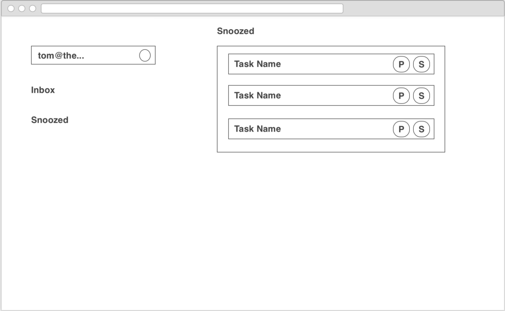
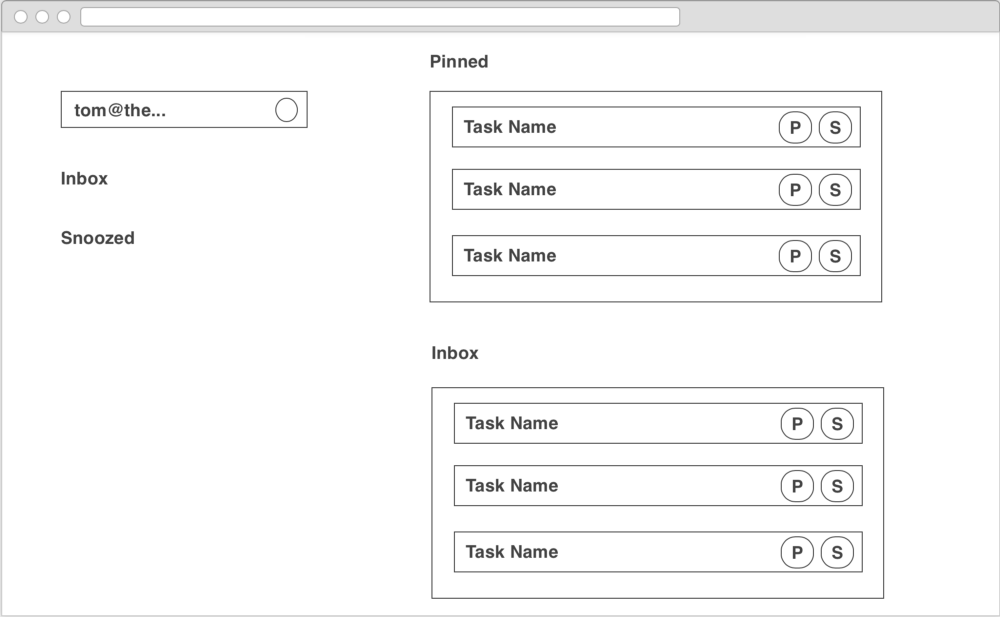
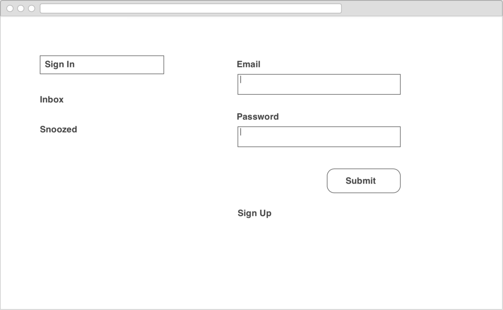
Wireframing is the processing of enumerating the screens in our application and laying out the elements that will appear on each screen at an organizational level. In part 2 we discussed the features we need in our app. Now let’s figure out the screens of our app by creating wireframes.
Since our requirements are pretty simple and we are working from a fairly fixed design, laying out the screens will be straightforward. After the layout, we can start identifying common UI elements — our shared components.

Finding common components
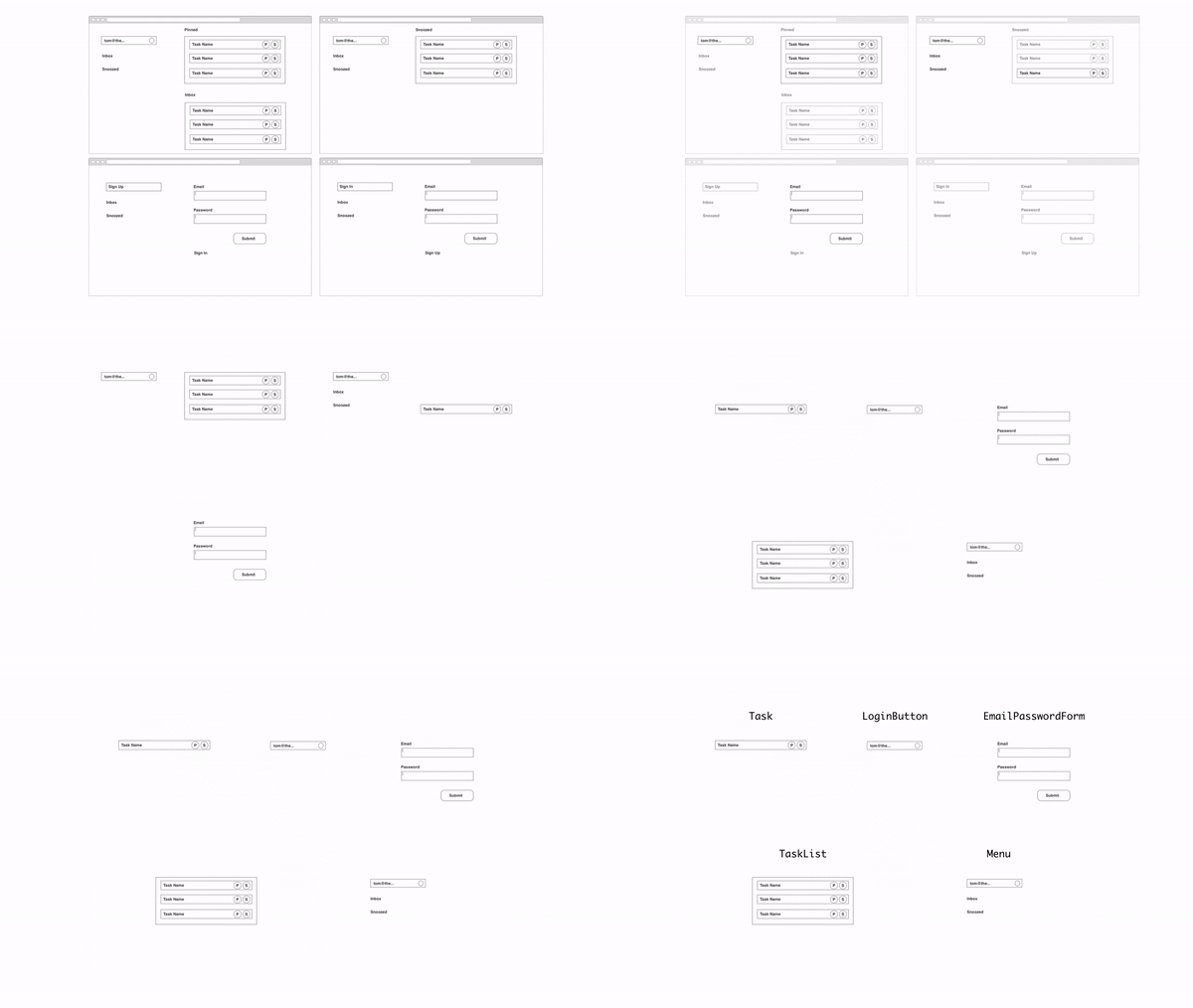
When we consider the screens above, we begin the process of extracting common UI elements. To start off with, we see a repeated Menu element on the left of each screen, with slightly different states depending on the screen we are on.
Within the Menu there is a LoginButton which displays the current user’s email. This will be the mechanism to allow us to sign up and login and associate services. We’ll dig in a little bit deeper into that component below.
On the right side of the Inbox and Snoozed Screens we see a TaskList containing a list of Task components. We’ll take a closer look at the Taskbelow, but just note here that the TaskList should be ordered reverse chronologically.
Finally, on the right side of the two authentication screens is a common UserPasswordForm element. It is fairly self explanatory.
Component index
Now we’ve enumerated our common components, we can start thinking about each component in detail; what are the different states the component can be in, and what data we will require from our server to properly display each of those states.
A key development principle we are working with in this project is to build schema first. This means we will design the data interface between our frontend UI and our backend server before building anything. As we’ll see, this technique will allow us to iterate on the two parts of our app independently. This series will mostly focus on the UI part, although part 6 will show you one way to build a Node-based backend using MongoDB.
So what information does each component need? Let’s dive into the Task component, the most complex component in this application.
Task

Our tasks display visually slightly differently depending on exactly what state our task is in. We display a checked (or unchecked) checkbox, some information about the task (and a link out), and either a “pin” or “snooze” button or both, allowing us to move the task around. Putting this together, we’ll need:
title— a string describing the tasksubtitle— a string describing the context of the task in the external system (e.g. “inapollographql/apollo-client”)url— a link to the external resource (clicking on the task will take us there).state— which list is the task currently in and is it checked off?
When we start to build our component, we’ll construct a list of test states corresponding to the different types of tasks we’ve sketched out above, providing a sensible mocked combination of the four fields above for each state.
We can use those states in our component explorer to ensure the resulting task renders consistently with our wireframes. If we had a visual design for each component state (which is an excellent idea if you want to take Component-Driven Development further into the design phase) then you would further be able to style the component states against the visual design also.
I’ll skip going into similar detail on the other components we’ve identified but briefly explain the data that they need:
TaskList
Needs a list of tasks with the fields above, plus an extra updatedAt date field so we can order the tasks reverse chronologically.
LoginButton
Requires a user’s email and two flags hasGitHubToken and hasTrelloToken of the current user (we’ll show a button to link their account if not).
Menu
Simply needs the info for the LoginButton.
UserPasswordForm
Has no data requirements (it will simply gather data and submit to a callback).
Schema Design
We now have enough information to build a basic first schema for our application. We are going to use GraphQL for our schema so we need to describe the various fields that live on each data type in our API. I’ll describe the schema in the Schema Language — the backend we’ll create will take this as input, plus it’s much easier to understand.
Hopefully we can see at this point how thinking about the components early can help use figure out our data requirements at a more granular level and hopefully get it right at this stage! (Of course we can change it later if necessary).
TaskState
We start with the TaskState, an enum that describes which list a task should be in:
enum TaskState {
  TASK_INBOX
  TASK_PINNED
  TASK_SNOOZED
  TASK_ARCHIVED
}
Task
The Task type needs at a minimum the fields we’ve listed above.
type Task {
  id: ID!
  title: String!
  state: TaskState!

  # These two are optional for now
  subtitle: String
  url: String

  # We'll use floats for dates for now, we could use a custom scalar
  updatedAt: Float!
}
User
The user needs the fields for the LoginButton and also an association to the lists of tasks we are going to show in the app. We can pass a state into the tasks field to filter the users’ list of tasks down to just the set we care about. We’d add pagination parameters in a real application, but for now we just want to get something working.
type User {
  id: ID!
  email: String!
  hasGitHubToken: Boolean!
  hasTrelloToken: Boolean!

  tasks(state: TaskState): [Task!]!
}
Query
Our root query type has a single field me, which corresponds to the current user (we don’t have any public data for now). So we can use a query like { me { tasks(state: TASK_PINNED) { title } } } to get a list of tasks.
type Query {
  me: User
}
Mutation
The root mutation type is where we put all our data modification methods. We’ll need to:
- Create users in the system.
- Associate services tokens to the current user.
- Update tasks to move them between lists.
input CreateUserInput {
  email: String!
  password: String!
}

input UpdateTaskInput {
  state: TaskState!
}

type Mutation {
  createUser(input: CreateUserInput!): User
  addServiceToken(serviceName: String!, token: String!): User
  updateTask(id: ID!, UpdateTaskInput!): Task
}
It’s a little harder to anticipate the mutations required for the app ahead of time, and in some sense it’s less critical to get them right at this stage. We are interested in knowing about our schema early so we can build out the visuals of our components without a working server, and set up mock and test data input data.
At this stage at least, it’s less possible to do similar things to mutations, although this may change.
For completeness, here is the complete schema we’ve just put together.
Onwards
Now that we’ve figured out the list of components we need and what the schema will look like, we can start building the components using a little bit of component-first infrastructure.
In part 4 linked below we’ll set up our frontend project and get into building the components listed above.
