Visual testing for Storybook
Chromatic catches visual and functional bugs in your stories automatically. It runs UI tests across browsers, viewports, and themes before changes merge. Made by Storybook.
No credit card required


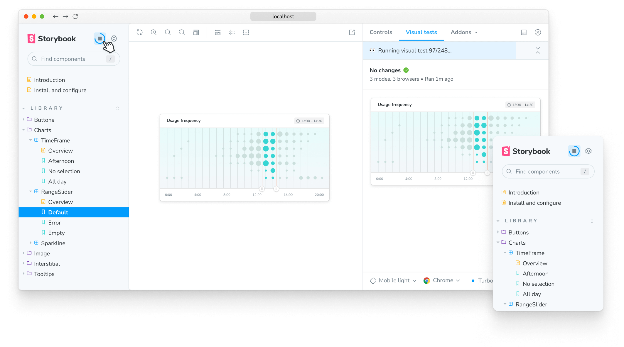
1-click testing for Storybook
Click a button to run visual tests in all the major browsers. You’ll get notified directly inside Storybook if components don’t look right. This accelerates the feedback loop and helps you ship pixel-perfect UIs faster.
“Setting up a first-class, cross-discipline contributor experience used to take my teams months. Today, I can build it myself in a few clicks thanks to Chromatic!”

How does visual testing work?
Visual testing scans UI changes for appearance bugs by taking a pixel-perfect snapshot of your UI, complete with styling and static assets. As you commit code, new snapshots are captured and compared to baseline snapshots.
Powered by your Storybook stories
Stories capture all states and variations of components. They give you a structured way to keep track of UI test cases. Chromatic uses these stories to power visual tests. Best of all, it just works with no configuration.
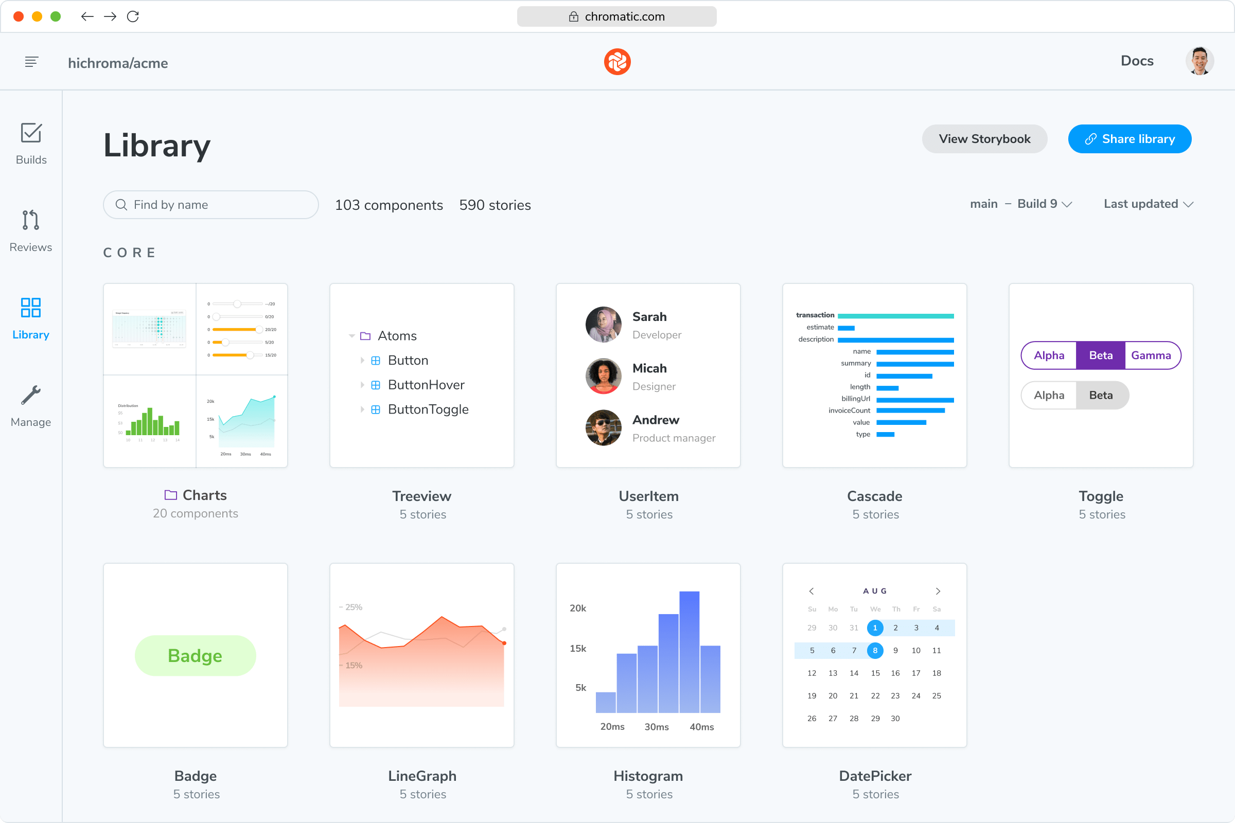
“The more things we have in Storybook, the more coverage we get in Chromatic.”

Spot the visual differences
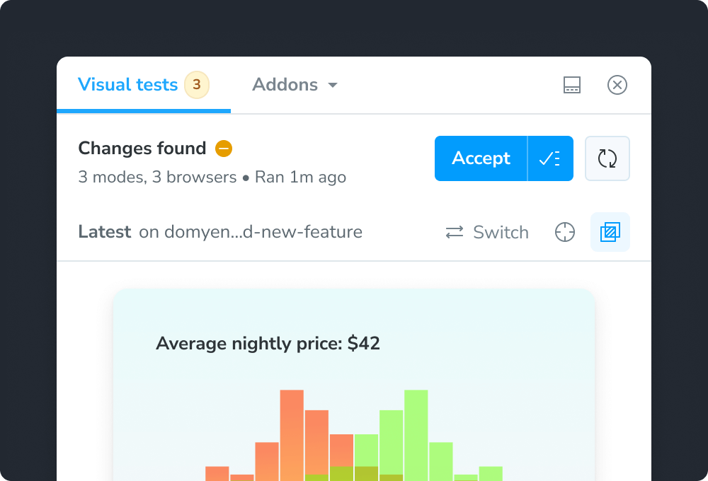
Detect visual changes in your stories down to the tiniest detail. Chromatic gives you a suite of debugging tools to help you see the differences.
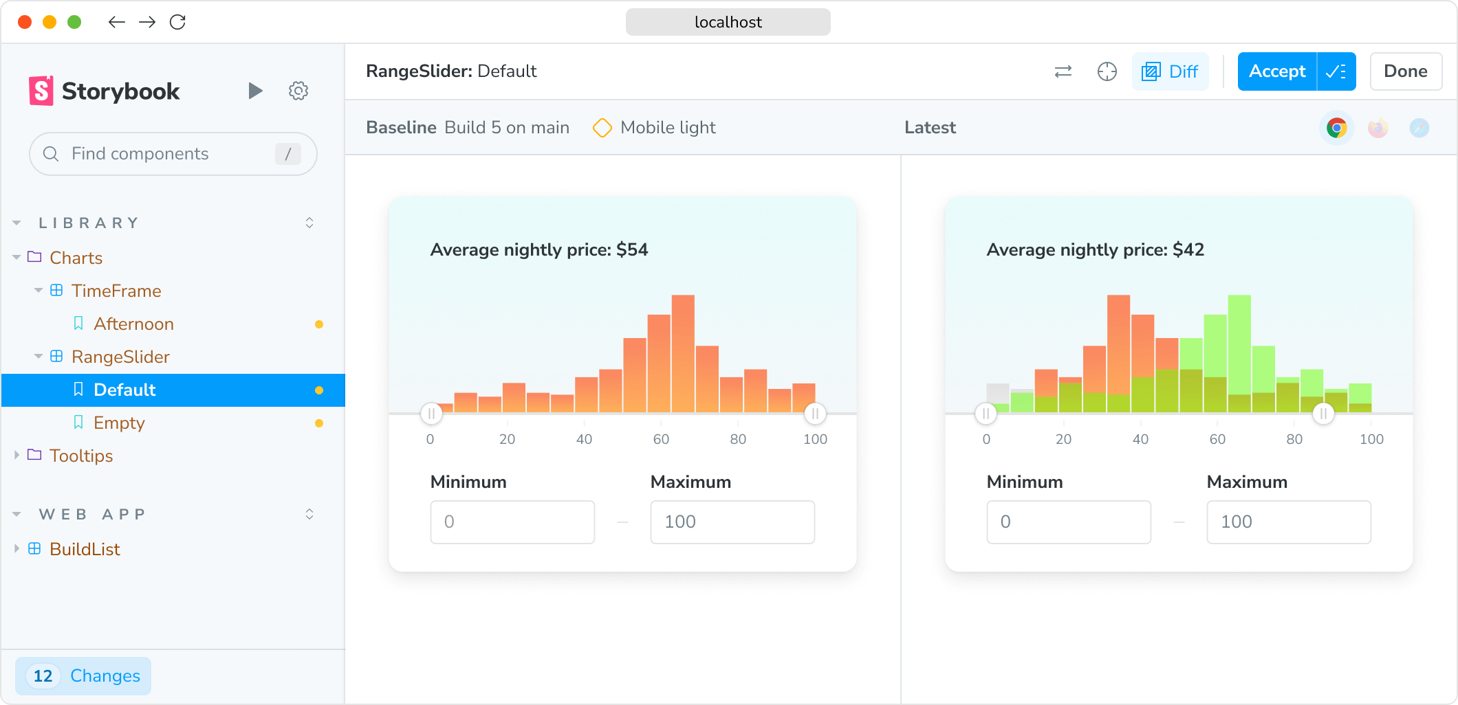
“Visual diffs make changes apparent and unmistakable... Chromatic has been extremely useful and confidence-inspiring.”

Run in CI for full coverage
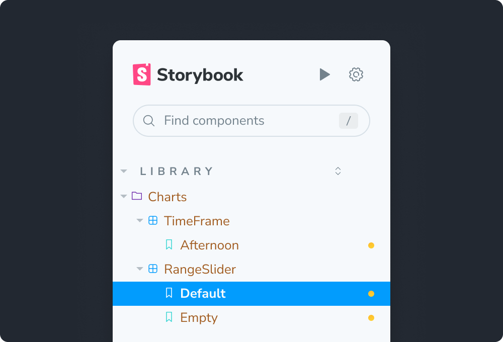
Chromatic is made to run both in Storybook and CI. When you run in CI, Chromatic keeps test baselines in sync across users and branches.
Frequently asked questions
“Chromatic has supercharged our PR reviews, making it easy to see visual changes at a glance. We have also come to rely on it to catch unintended style changes and regression bugs in our components.”
